

Rebel
Sr Art Director
Rebel Convenience is a regional convenience store chain trying to position itself against the category default — sterile, fluorescent, transactional. The brand had a bold visual identity already, but the website didn't reflect it. The redesign needed to translate Rebel's in-store energy into a mobile-first digital experience that actually felt like the brand it claimed to be.
The Website
Mobile-first, because convenience store customers are checking hours, locations, and deals from their phones, usually on the move. The site is organized around the three things people actually come to it for: where the stores are, what's on promotion, and what's new. Navigation is direct — no nested menus, no marketing copy in the way of the answer. The layout uses Rebel's existing brand palette at scale, treating green and bold typography as the structural elements rather than decorative ones.
Motion design appears where it earns its place — section transitions, content reveals, button states — and stays absent where it would slow the user down. The goal was energy without latency.


The Social Direction
The accompanying social system extends the same visual logic into Instagram and short-form video. Bold flat graphics, punchy headlines, motion that reads at thumb-scroll speed. The content was built to drive store visits, not just engagement — every post has a clear path back to a location, a promotion, or the site.


Rebel
Rebel Convenience is a regional convenience store chain trying to position itself against the category default — sterile, fluorescent, transactional. The brand had a bold visual identity already, but the website didn't reflect it. The redesign needed to translate Rebel's in-store energy into a mobile-first digital experience that actually felt like the brand it claimed to be.
Sr Art Director
Sr Art Director
The Website
Mobile-first, because convenience store customers are checking hours, locations, and deals from their phones, usually on the move. The site is organized around the three things people actually come to it for: where the stores are, what's on promotion, and what's new. Navigation is direct — no nested menus, no marketing copy in the way of the answer. The layout uses Rebel's existing brand palette at scale, treating green and bold typography as the structural elements rather than decorative ones.
Motion design appears where it earns its place — section transitions, content reveals, button states — and stays absent where it would slow the user down. The goal was energy without latency.
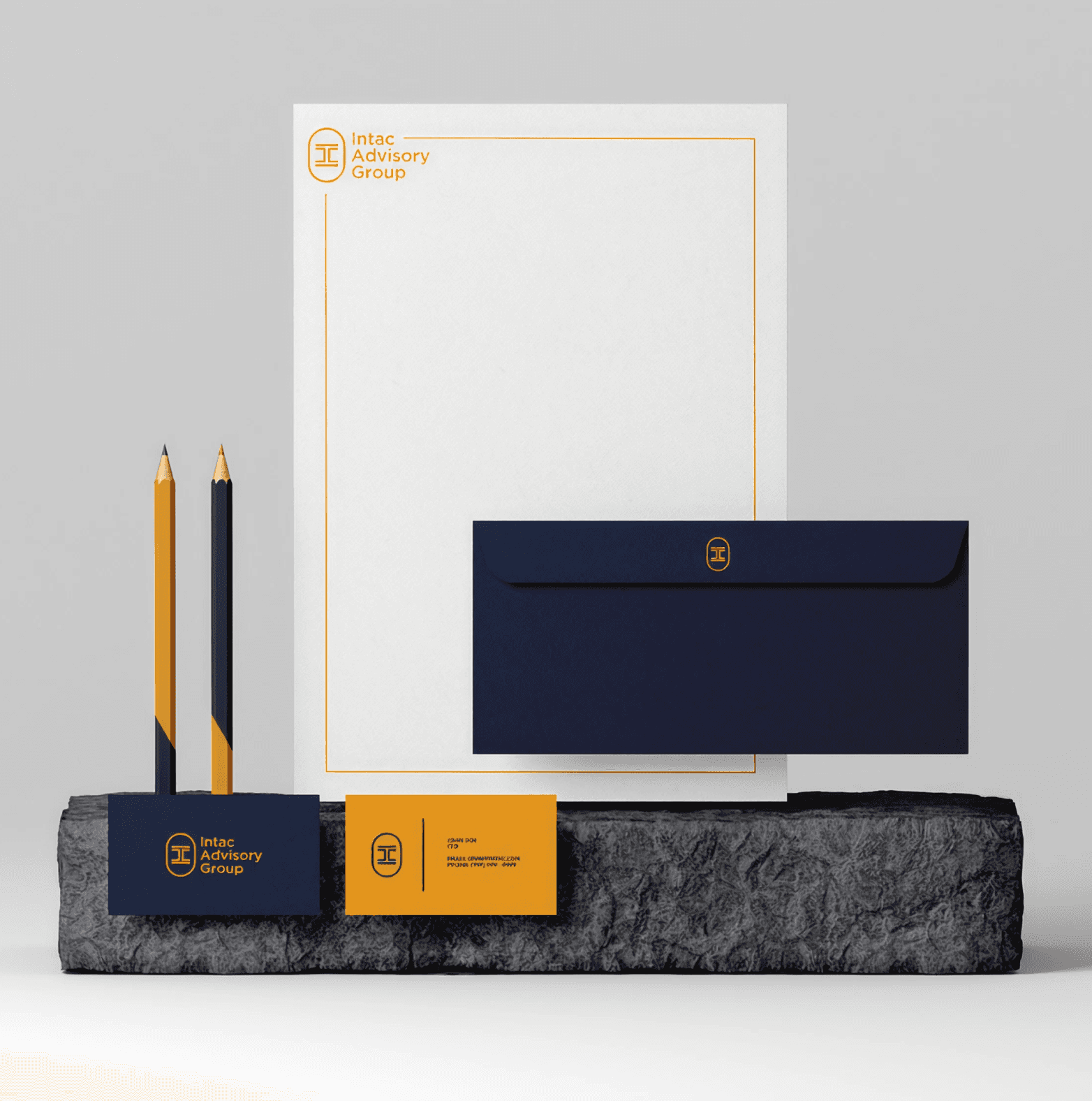
Intac
Branding • Digital • Marketing
View Case Study

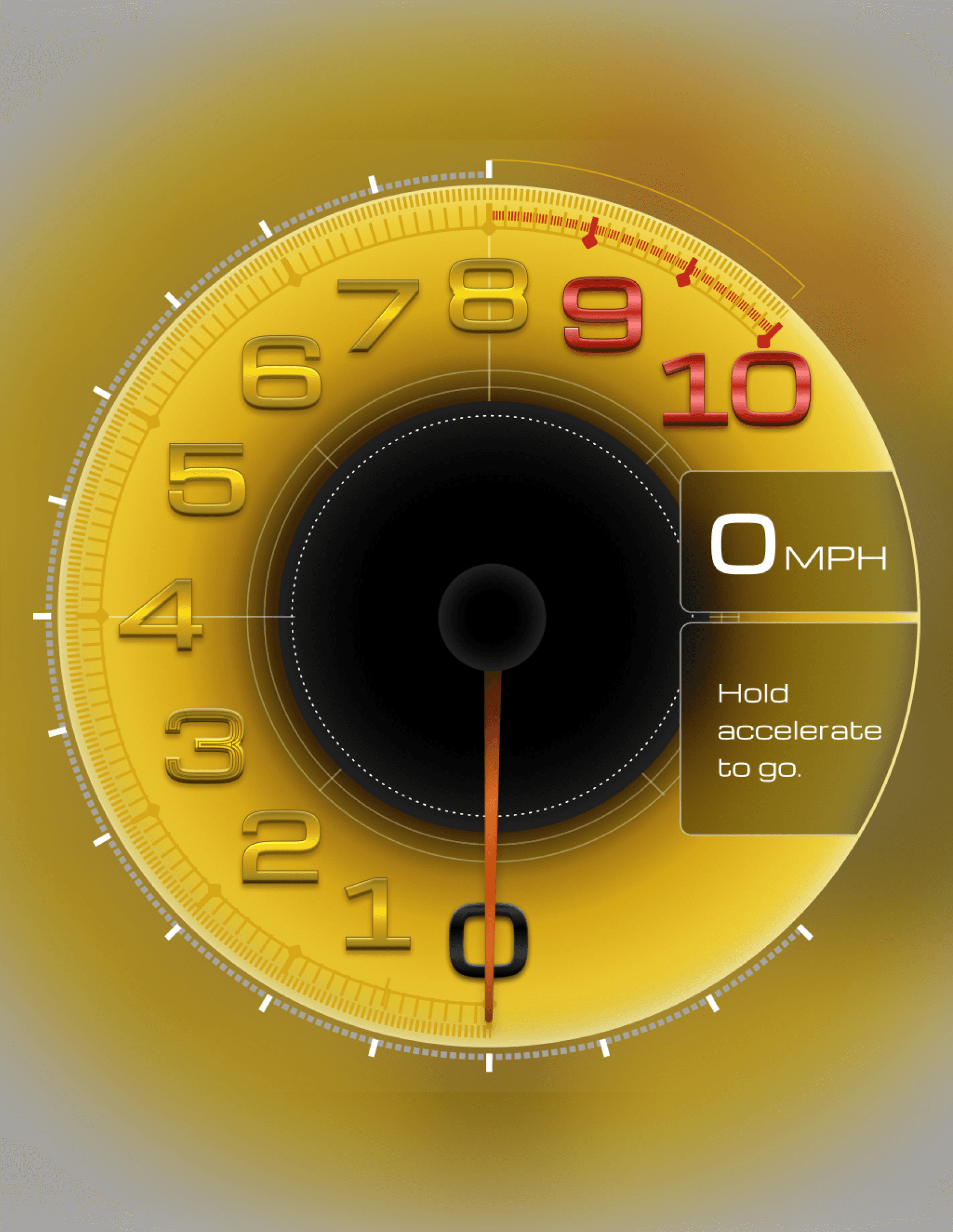
Mobil1
Product
View Case Study
The Social Direction
The accompanying social system extends the same visual logic into Instagram and short-form video. Bold flat graphics, punchy headlines, motion that reads at thumb-scroll speed. The content was built to drive store visits, not just engagement — every post has a clear path back to a location, a promotion, or the site.


Thank You!
Let’s Get In Touch
Anthony Cao


Thank You!
Let’s Get In Touch
Anthony Cao
Dallas, Tx